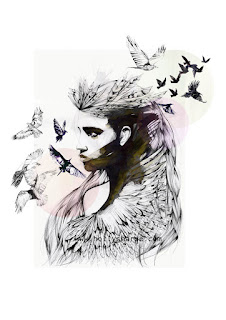
Daniel Egneus
I really like how all of the image is in black and white and the heart is the only colour. I also like how the drawing looks like it has been done with a fine point pen, creating a neat look. I also like how not only does the heart stand out because it is a different colour, but the way it is painted with water colour creates a abstract affect. Have the neat black lines in contrast with the abstract heart makes both styles stand out more.

I like the use of fine lines in black and then having the water colour effect highlighting in colour only parts of the illustration.
Mixing what looks like fine pen drawings with either paint or charcoal.
Holly Sharpe
I like the imagery of merging the faces of the women and the different animals. The placement of the butterflies and the birds makes both these illustrations visually appealing to the eye. the composition of the different elements in these illustrations work well- there's a balance.
I like the colours and how the red and the blue colours in the background create the purple colour for the image of the girl in the middle.
I think the messy watercolour style is interesting also.
Judit García-Talavera
I really like the repetition in this illustration and how although the women has been repeated, the different colouring creates three different illustration. I think the colours used in this work well together.
I like the washed out watercolour style of painting. I also like how in the illustration is incomplete in the corners, creates a 'memory' type of vibe.
My Dead Pony
I like the washed out colours and water colour effect.
I also like the combination of text and images . These images are pretty abstract and contemporary.


No comments:
Post a Comment